Process
For this final assignment, we had to evaluate our group project in a more systematic and critical way. Our playground was aimed at making website prototyping more physical and hands-on by combining a tangible wireframing kit with a digital scanning and editing system. Instead of designing a webpage directly on a screen, users first build a wireframe physically with cards on an A4 sheet, after which the design/document is scanned with a phone and translated into a digital webpage.
Looking back at our group process, it becomes clearer when it is described as a sequence of iterations rather than as one final design plus evaluation. In iteration 1 (Assignment 5.1), we framed the playground as a concept and defined the technical hurdle: making website prototyping more physical and hands-on by translating a paper composition into a digital webpage. In iteration 2 (Assignment 5.2), we built a first physical MVP that made the concept tangible through an A4 workspace, laminated UI cards, scanning, and editing. During this phase, we already tested the technical feasibility of the concept at home by checking whether the ArUCo markers were recognised correctly, whether the UI cards could be positioned on the page in a stable way, and whether the mobile and PC views worked together in practice. In iteration 3 (Session 7, Session 8, and this final evaluation), we tested how the complete setup worked in use: first in a more structured group test with fixed roles and observations, and later in the demo market with teachers and students interacting with the playground more openly. Describing the project this way makes it clearer that the group assignment was not one design moment, but a process in which concept, material, scaffolding, and evaluation were refined together.
The Interaction Technology programme is explicitly framed around moving from ideation to prototyping to evaluation in the design of interactive systems, so it made sense to approach our final playground in the same way: not only asking whether the system works, but also how people use it, what it supports, and where its limits are.
Design Description
Our final design is a tinkering playground for physically prototyping websites. The first framing of this idea was described in 5.1 Group Assignment - Playground design, while the first working prototype was developed further in 5.2 Group Assignment - Physical MVP, first iteration and shown in Session 6. The core problem we addressed was that early-stage interface design often happens directly in digital software, which can make the process feel rigid too quickly. We wanted to create a more tangible and collaborative way of working, where users can first arrange website elements physically and only later move into digital refinement.
The playground consists of several connected parts. The physical setup is stored in a box (see Figure 1), which also includes the instructions for use (see Figure 2), the full contents of the kit (see Figure 3), and the various UI cards that users can work with while prototyping (see Figure 4). More specifically, the playground contains:
- an A4 base sheet with ArUCo markers in the corners to define the workspace and orientation;
- a set of (physical) laminated UI cards representing webpage elements such as text, buttons, images, and headers;
- blank laminated cards on which users can write their own elements with whiteboard markers;
- a mobile interface that allows users to scan the page, detect the markers, and edit the resulting webpage elements;
- and a PC/laptop view that shows the translated digital webpage to the whole group.
One of the key design choices was that the physical kit should lower the threshold for starting, while the digital system should support refinement afterwards. That is why we deliberately did not stop at only making cards and an A4 sheet; we wanted the physical and digital parts to work together as one playground.
Another important design choice was to increase durability and reusability. In the first iteration, the physical cards were simply printed on paper. Later, we laminated the cards so they could be handled more often and so users could also write on blank pieces themselves. This was an important improvement because it made the system less fixed and more open-ended. The resulting kit, including the organised box and reusable materials, can be seen in Figures 1 through 4.
On the technical side, the design also changed significantly over time. Earlier versions already detected ArUCo markers, but later iterations improved the robustness of the workflow. We enabled full camera resolution, added a camera-selection dropdown, included a flashlight toggle for darker environments, allowed users to upload photos from their gallery, improved cross-browser support, and refined the mobile interface layout. We also improved the translation from physical wireframe to digital webpage by assigning separate ArUCo markers to the card corners, making rotation detection more accurate. To keep the output stable, rotations were snapped to 90-degree angles when close enough. In addition, we added a backlog of previous photos so users could revisit, compare, and delete earlier iterations instead of starting from scratch every time.
So the final design is not just a box with cards, but a full playground in which physical arrangement, digital translation, and iterative improvement support each other.
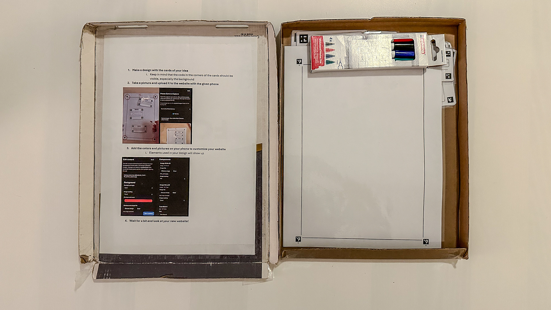
Figure 1. Overview of the box.
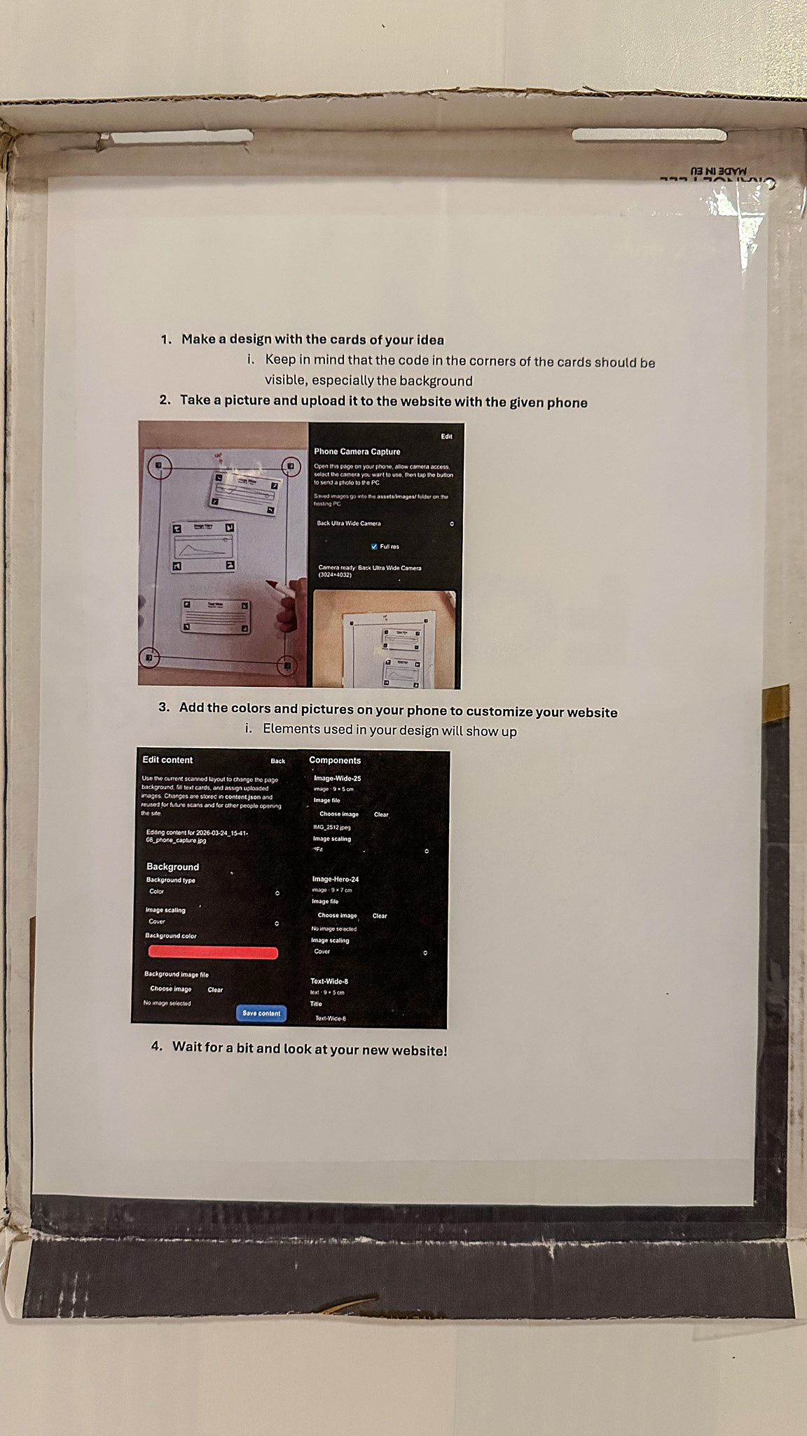
Figure 2. The instructions.
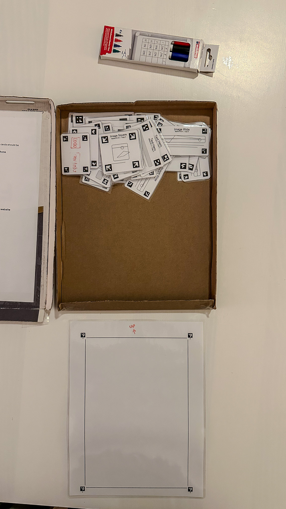
Figure 3. The contents of the box.
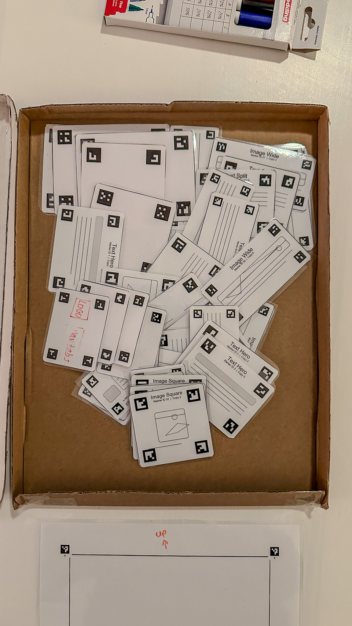
Figure 4. The various UI cards.
Evaluation Method
We evaluated the project in three connected stages.
1. Technical and formative testing during development
Before the structured test in class, we repeatedly tested the system ourselves at home while developing it. These tests were mainly technical and formative. We checked whether the cards were detected correctly, whether their position and rotation were translated reliably, whether the phone and laptop communicated well, and whether the application worked across browsers and devices. These tests directly informed design choices such as the flashlight toggle, the camera-selection menu, higher camera resolution, and the photo upload option.
This phase was important because it made later user testing possible at all. Without a stable technical baseline, it would have been difficult to evaluate the playground meaningfully in use.
2. Structured evaluation in Session 7
The first more systematic evaluation took place in Session 7, where we tested the playground with fixed roles, informed consent, and observation. Bas acted as the facilitator, Ewoud and the rest of the team acted as observers, and Tycho and I acted as participants. The purpose of this session was not just to see whether the code worked, but to evaluate the complete setup: materials, instructions, scanning workflow, editing process, and the connection between physical and digital output.
To make this stage more systematic, we used the following observation structure:
- Participants: Tycho and I
- Facilitator: Bas
- Observers: Ewoud and the rest of the team
- Task: Create a webpage layout with the physical kit, scan it, and refine it digitally
- Observation focus: Where users hesitate, what needs explanation, whether the scan-to-page translation is accurate, and whether the setup supports discussion and iteration
- Success indicators: Correct marker detection, usable digital output, understandable workflow, and visible room for multiple design directions
This meant that the evaluation focused on both outcome and use:
- Outcome: Does the playground actually produce a webpage design that matches the physical composition?
- Use: Is the process understandable, usable, collaborative, and supportive of tinkering?
3. Demo-market evaluation in Session 8
In Session 8, we used the same overall structure again, but in a more open demo setting. After the one-minute presentations from 5.3 Group Assignment - Complete design, digital poster, teachers and students interacted with our playground at the table. We demonstrated the full workflow and observed how people understood and used the system. In particular, Mr Dertien and Ms Mader both created webpage designs themselves, and other students also interacted with the setup.
Although this phase was less controlled than Session 7, it was useful because it showed how the playground functioned in a more realistic presentation context: with people approaching it fresh, asking questions, trying it out, and responding to the concept in their own way.
Evaluation criteria
Based on the assignment and the course focus on evaluating tinkering playgrounds not only in terms of whether they work, but also in terms of openness, complexity, and room for discovery, I think the most relevant evaluation criteria were the following:
1. Critical performance
Does the system work reliably enough to support the intended activity? This includes marker detection, scanning, translation accuracy, editing, and overall workflow stability.
2. Use and onboarding
Is it clear how to start? Are the materials understandable? Does the sequence from physical composition to digital output make sense?
3. High ceiling
Does the playground allow users to move beyond one simple result? Can it support more complex or more refined outcomes?
4. Wide walls
Does the playground support different kinds of results and applications, or does it only lead to one narrow outcome?
5. Collaboration and reflection
Does the setup support group discussion, iteration, and comparison of variants?
These criteria also connect back to the material properties discussed earlier in Assignments 3.1 and 3.2. Critical performance, especially the reliability of scanning, marker detection, and translation, relates strongly to feedback and iteration speed. Use and onboarding relate to low threshold and self-guiding qualities. High ceiling and wide walls relate directly to the material properties, while collaboration and reflection depend partly on how discussable and rearrangeable the material setup is. Combined/Read together, these criteria make it possible to judge the playground not only as software or only as a physical kit, but as a tinkering material in use.
Evaluation Results
1. Critical performance
The most important result is that the system worked as a full chain: users could place physical UI cards, scan them with a phone, see the detected markers, translate the design into a webpage, and then further edit the content digitally. That means the core promise of the playground was achieved.
At the same time, the evaluation also made clear that this critical performance depended on several technical conditions. The detection process worked much better after we improved the rotation tracking and added support for better camera handling. The flashlight toggle and image upload option were especially important in practice, because lighting and camera setup strongly affected recognition quality (mainly because the laminated cards reflect light easily). So the system became much more robust than the original proof of concept, but it was not yet effortless or invisible. The technical layer still mattered quite a lot.
This also became visible in the demo sessions. Both teachers (and several students) were able to use the system and create webpage designs themselves, which supports the claim that the full workflow was functional. However, Ms Mader needed additional explanation about how the code worked and how the system translated the physical layout into a digital one. That shows that the system was usable, but not fully self-explanatory at a technical level (which we can also discuss is not needed in practice).
Strength: The full scan-to-page chain worked in practice.
Limitation: Performance still depended on relatively controlled conditions and sometimes on explanations from the designers.
2. Use and onboarding
In terms of use, I think the playground performed well. The A4 sheet clearly framed the workspace, the physical cards made the design elements tangible, and the act of arranging pieces on paper was easy to grasp. This created a low threshold for getting started. Users did not have to begin in abstract software or from an empty screen. Instead, they could move pieces around, compare options, and physically construct a design.
The laminated blank cards were also a great improvement, because they prevented the playground from becoming too closed or predetermined. Users were not restricted to only the prepared set of cards, but could still add their own ideas.
At the same time, the onboarding was only partially embedded in the material itself. In Session 7 and Session 8, the process worked best when someone first explained the sequence: place cards, scan them, inspect the result, then refine digitally. So while the physical kit was understandable, the relation between physical composition, marker recognition, and digital editing did not yet fully explain itself through the materials alone. That is also why we made an instruction document on the inside of the box.
Strength: The actual entry point was clear and approachable.
Limitation: The full physical-digital workflow still requires facilitation and scaffolding.
3. High ceiling
I think our playground clearly showed a high ceiling. Users were not limited to one fixed webpage structure or one fixed result. The physical kit could be used to create many different page layouts, and after scanning, the mobile editing system allowed users to continue refining text, colour, image content, and formatting (also together at the same time on multiple phones).
The high ceiling also became visible in how people started thinking beyond simple webpage design. During the demo, Mr Dertien explicitly appreciated that the system could also be used in other ways, for example, for furniture blueprints or more general interface layouts. That suggests that the playground is not limited to one tiny exercise, but can support more advanced or more exploratory outcomes.
A critical note here is that the high ceiling was stronger in layout and iterative refinement than in completely free formal expression. The system still depends on a recognisable card language for the user and on marker-based translation for the system. So while it supports complexity and further development, it does not offer unlimited freedom. It is a structured high ceiling, not a fully open one.
Strength: The playground supported increasingly complex layouts, refinements, and adjacent use cases.
Limitation: The ceiling is high within the system’s grammar, but that grammar still constrains the kinds of outcomes that are possible.
4. Wide walls
The playground also performed well on wide walls. Even with the same toolkit, different users could produce very different results. The prepared UI cards support many possible page structures, and the blank cards add room for custom elements. The system can be used individually or collaboratively, and it can support different design goals such as making a website homepage, a workflow interface, or even another structured visual plan.
What makes this especially strong is that the physical nature of the system changes the design conversation. People can move things around, compare alternatives next to each other, and discuss designs more spatially. That gives the kit wider walls than a fully predefined worksheet would have.
A concrete sign of this was that users did not only follow one expected path. During the demo, the system immediately invited discussion about other applications besides webpage design, and the blank cards also made it possible to move beyond the pre-made UI vocabulary. That indicates that the playground does not only reproduce one fixed exercise.
Still, there are limits. The playground is still oriented toward card-based design and a recognisable rectangular UI structure (now A4). It is not equally suited for every possible digital product or interaction style. In that sense, the walls are wide, but not endless.
Strength: The same kit supported multiple layouts, interpretations, and adjacent applications.
Limitation: The playground still favours structured, modular interface design over other forms of prototyping.
5. Collaboration and reflection
One of the strongest results of the evaluation was that the playground supported collaborative interaction well. In the demo, multiple people could work together around the A4 sheet, discuss which cards to place, and then inspect the digital result together on the larger screen. This was one of the key values of making the design problem physical in the first place.
The PC view was also important here. It allowed the resulting webpage to be shown to the group, rather than leaving the experience only on one phone screen. That made comparison, discussion, and iteration easier.
In that sense, the playground not only supported making a result, but also supported the reflective side of tinkering: trying something, seeing what happens, discussing it, and changing it again.
A more critical point is that the scanning step still centres some control in the hands of the person using the phone. So while the physical phase was strongly collaborative, the transition to digital sometimes became more single-user than the tabletop part itself. Even though the editing could be done on multiple phones at the same time.
Strength: The setup supported shared discussion, comparison, and reflection.
Limitation: The phone-based scanning/editing step could still centralise control.
Critical Reflection
Although the evaluation was positive overall, there are also several limitations that are important to mention.
First, our more systematic test in Session 7 was still done largely within our own group, because other teams had already left. That means the evaluation was not as independent as it ideally could have been. We did partially compensate for this in Session 8 through the demo market, where teachers and students interacted with the system, but the most structured observation phase still remained close to the design team.
Second, the system’s reliability still depends on technical conditions such as lighting, camera quality, and marker visibility. We improved this significantly, but it remains a point of vulnerability. In other words, robustness improved substantially, but it is not yet strong enough to ignore environmental conditions.
Third, while the playground supports wide walls and a high ceiling, it still relies on a relatively structured interaction language. Users compose with cards, scan them, and edit the result. This means the system is more open than a fixed template, but less open than completely free prototyping material.
Finally, the onboarding still depends partly on the designers/facilitators. The physical cards invite action, but the full physical-digital loop is not yet completely self-guiding (even with the help of the instruction document in the box and comments on the mobile website).
These limitations do not invalidate the project, but they are important to consider for future development (and because the assignment explicitly asks for a critical analysis rather than only confirmation).
Conclusion
Overall, I think the evaluation shows that our group project succeeded as a tinkering playground. The design worked in practice, the physical and digital parts supported each other, and users were able to create webpage designs by arranging materials physically first and only then translating them into a digital version.
The strongest qualities of the playground are its tangible entry point, its support for collaboration, and the fact that it has both a high ceiling and reasonably wide walls. It not only supports one narrow outcome, but also allows different page structures, refinements, and even adjacent applications.
At the same time, the evaluation also showed clear limitations. The system still needs explanation, depends on technical conditions, and was not tested as independently as would ideally be the case. So the result is not that we built a perfect or finished product. Rather, we built a strong and working first playground that demonstrates clear value, while also making visible where the next improvements should be.
For me, that is also the most useful outcome of the evaluation: not just that the project worked, but that we now understand much better how it works, why it works, and where it still needs development.