Process
After Session 6, we further developed the first physical MVP of our website wireframing playground based on the feedback we received. Because we already had a working proof of concept at that point, we were slightly ahead of schedule and could use this assignment to refine the idea instead of only trying to get the basic concept running. The main technical hurdle we were addressing was how to make website prototyping more hands-on and accessible by letting users build a webpage physically first and only then translate it into a digital design. Our first iteration, therefore, combined a physical setup with a digital system, namely an A4 base sheet with ArUCo markers in the corners and a set of separate UI cards that could be arranged on top of it and scanned with a phone.
It is also useful to distinguish between what we designed and what we selected in this first iteration. We designed the A4 workspace, the ArUCo-based UI cards, the blank editable cards, the scan-to-page workflow, and the mobile and PC interfaces. At the same time, we deliberately selected accessible off-the-shelf materials such as laminated paper, whiteboard markers, phones, and a laptop, because these kept the threshold low and made it possible to prototype quickly without expensive fabrication. This distinction matters because the playground is not only the digital system or only the paper kit, but the combination of designed interaction logic and carefully chosen materials.
The physical MVP was improved in several ways. We laminated the paper UI pieces so they became more durable and reusable, which made the kit better suited for repeated handling and rearranging (see Figure 1). We also bought whiteboard markers so users could write on blank cards themselves. This was important because it meant the prototype was not limited to a fixed collection of prepared elements. Users could still start with the existing cards, but they could also add their own text or interface ideas while working. That made the prototype more open-ended and more supportive of experimentation. Instead of only showing a concept, we were building a material setup that invited people to try, move, adapt, and remake.
In this iteration, the mobile view became the main interface for individual users. This is the view in which a user takes a photo of the physical wireframe and then adjusts the detected UI cards by changing colours, images, text, and formatting, such as bold or italic (see Figure 6). The PC view had a different role. It was meant for a general screen or beamer, so that the resulting designs could be shown to the whole group and discussed with others. This distinction made the system more useful in practice because the phone supported individual creation and editing, while the larger screen supported collective viewing and reflection.
Tycho and I mainly worked on the programming side of the system and went through several iterations to improve both usability and reliability. We enabled full camera resolution, added a dropdown menu for camera selection (see Figure 2), implemented a flashlight toggle for dark environments (see Figures 3 and 4), and made it possible to upload a photo from the file system or photo library (see Figure 5). We also improved the mobile interface so it better fitted a phone layout in terms of colours, spacing, and overall appearance. In addition, I tested different libraries to make the application work well across browsers and across both macOS and Windows. These changes were not just cosmetic. They were necessary to make the prototype stable enough to function as a real first iteration, rather than a fragile demo.
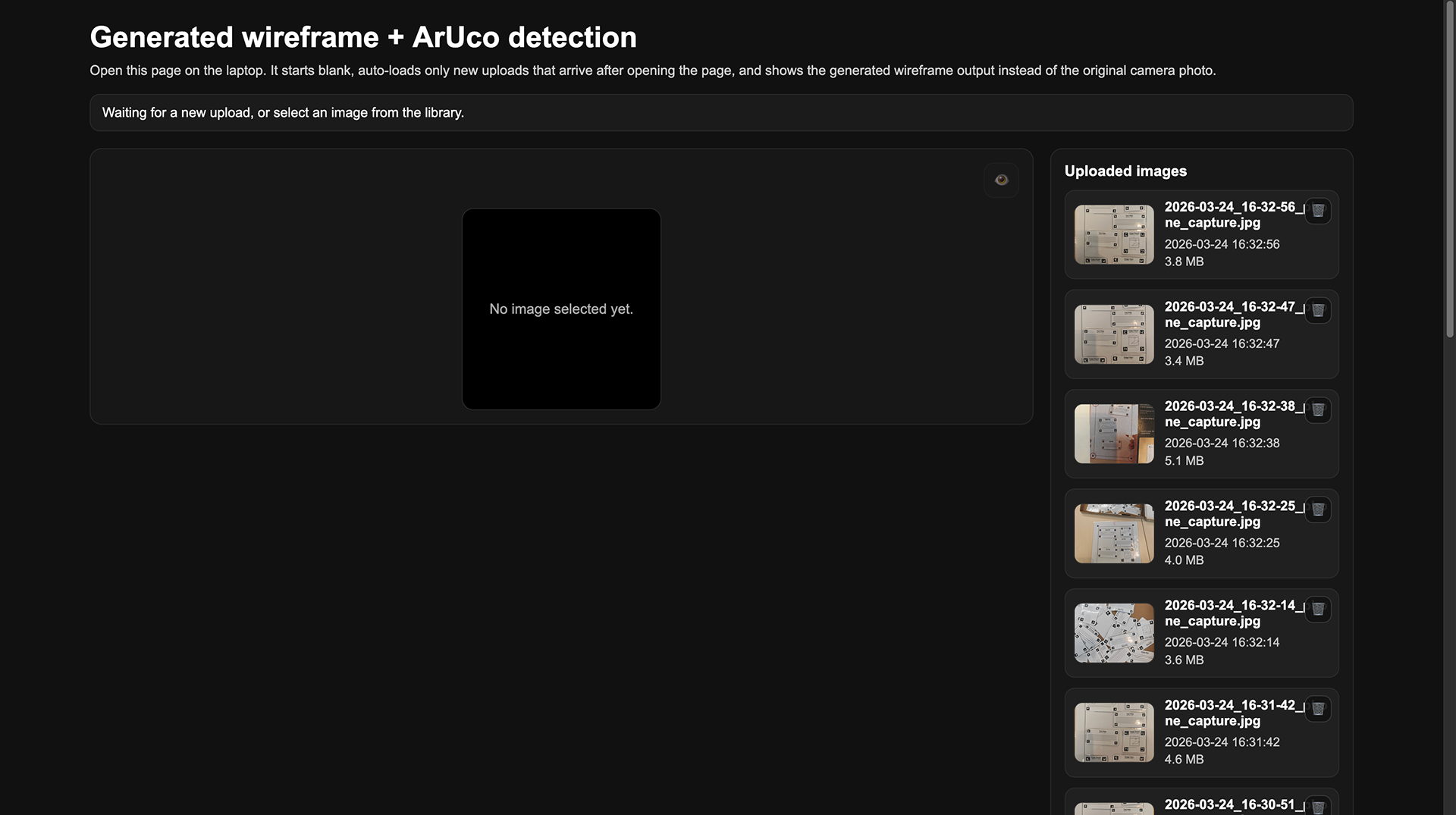
The most important programming improvement was the ArUCo-based translation from the physical wireframe to the digital webpage. In the earlier version, the system could already detect markers, but in this iteration, we improved the visualisation so that the UI cards were not only recognised as separate elements, but were also placed in the correct position on the digital page. We also improved the detection of card rotation by giving the four corners their own ArUCo markers (see Figure 1), which made it possible to trace orientation more accurately. To keep the result stable, we locked the rotation to 90-degree angles whenever the detected rotation was close enough, within plus or minus 10 degrees. This meant that the photographed paper composition could be translated much more directly into a usable web design. We also added a second page in the mobile application to support this editing workflow (see Figure 6). Finally, we added a backlog of previous photos, allowing users to revisit, select, and delete earlier iterations (see Figure 7). Together, these functions made the prototype more useful for iterative design, because users could both create and refine their wireframes instead of starting over each time.
Seen through the material properties from Assignments 3.1 and 3.2, this first MVP already shows a number of relevant strengths and limitations. The kit has a relatively low threshold because the A4 sheet and prepared UI cards made it immediately clear where to start. It is also fairly self-guiding: by handling the materials, users can understand that cards belong on the page and that a photo translates the composition into a digital version. Feedback and iteration speed are also strong because a layout could be rearranged quickly, photographed, and then adjusted again. At the same time, the high ceiling and wide walls are still somewhat limited in this iteration. The blank cards help expand the design space, but the system still largely depends on the existing UI vocabulary and on the reliability of the marker-based workflow. In that sense, the first MVP already functions as a real tinkering material, but one that still needs refinement in openness and robustness.
At this stage, the scaffolding is still fairly minimal, but it is already present in the design of the materials and interaction itself. The A4 sheet defines the workspace and orientation, the predefined UI cards lower the threshold for getting started, and the blank laminated cards still leave room for users to introduce their own ideas. The editing page in the mobile application also acts as scaffolding, because it allows users to correct or elaborate on their physical composition after scanning, rather than having to get everything right immediately. In that sense, this first iteration does more than present a goal and a collection of materials. It includes a tangible technical building block and an initial form of guidance that helps users move from physical experimentation to digital output.
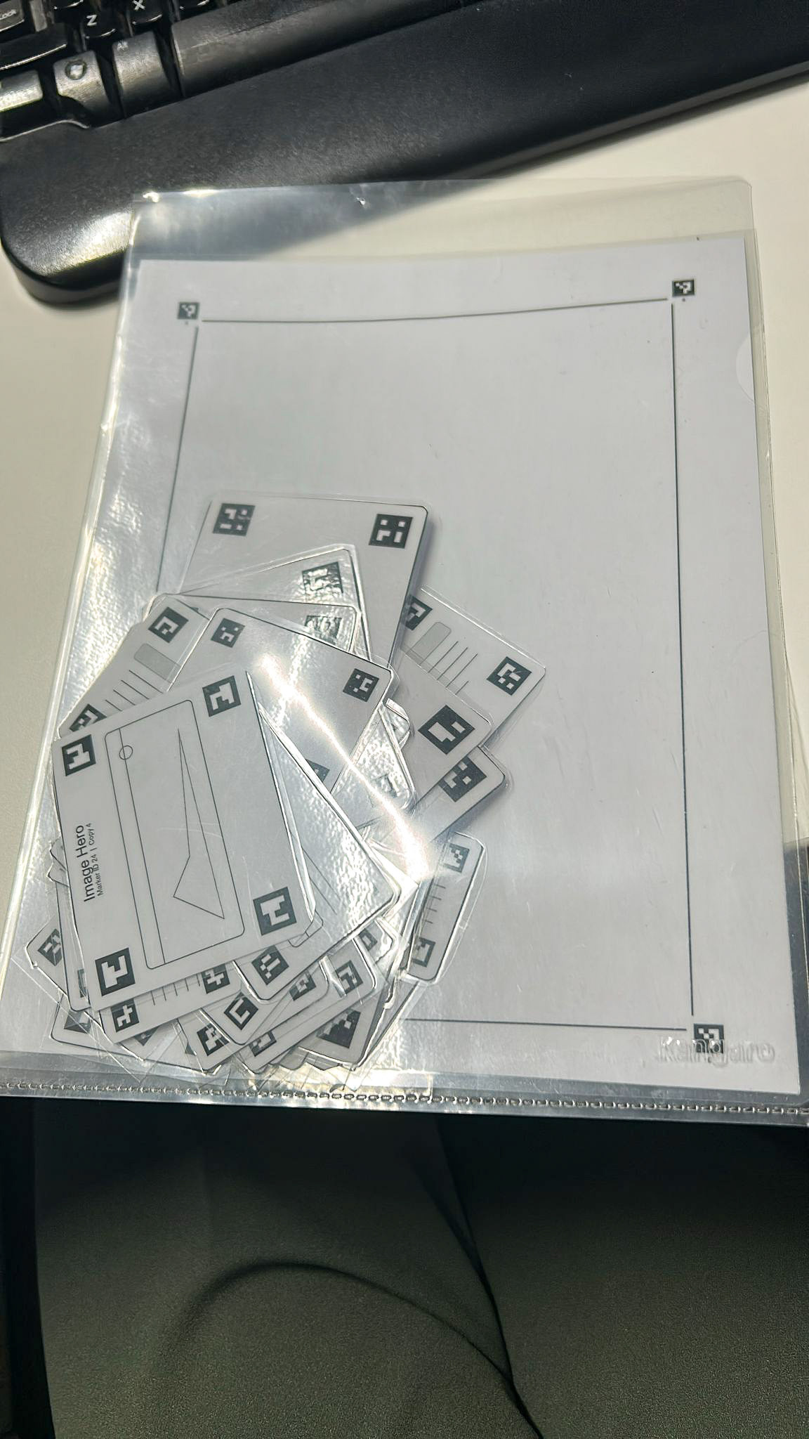
Figure 1. The paper plastified web interface cards.
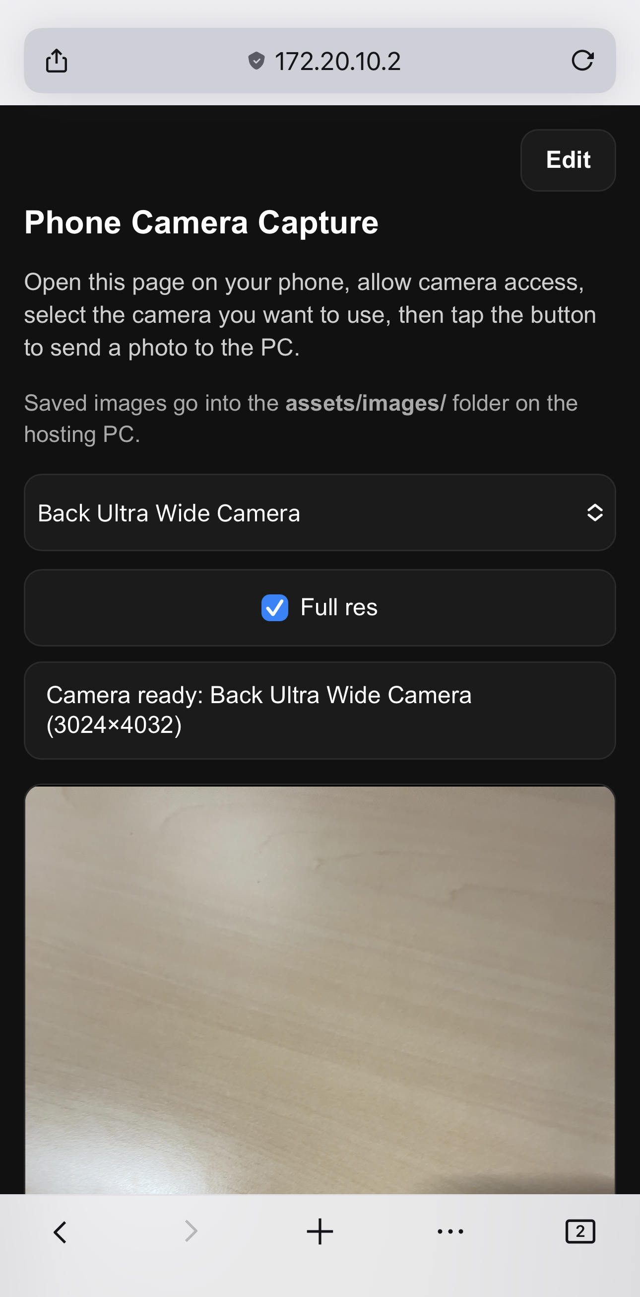
Figure 2. Phone view of the home page (1/2).
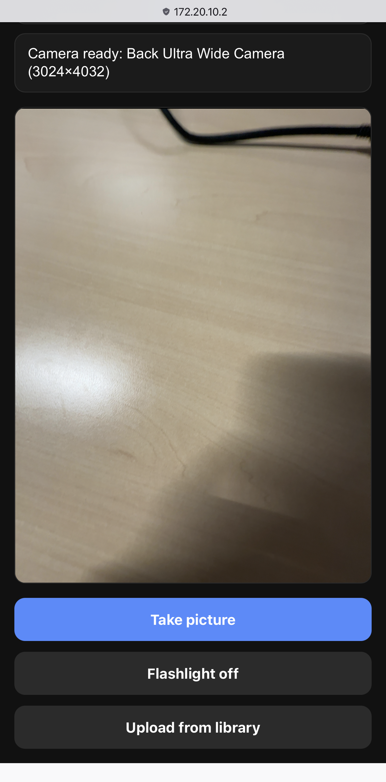
Figure 3. Phone view of the home page (2/2).
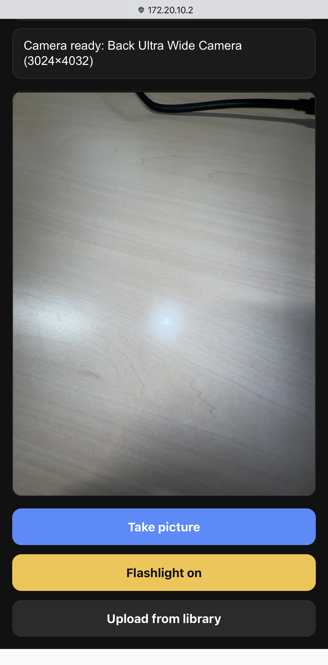
Figure 4. Phone view of the home page with flashlight enabled.
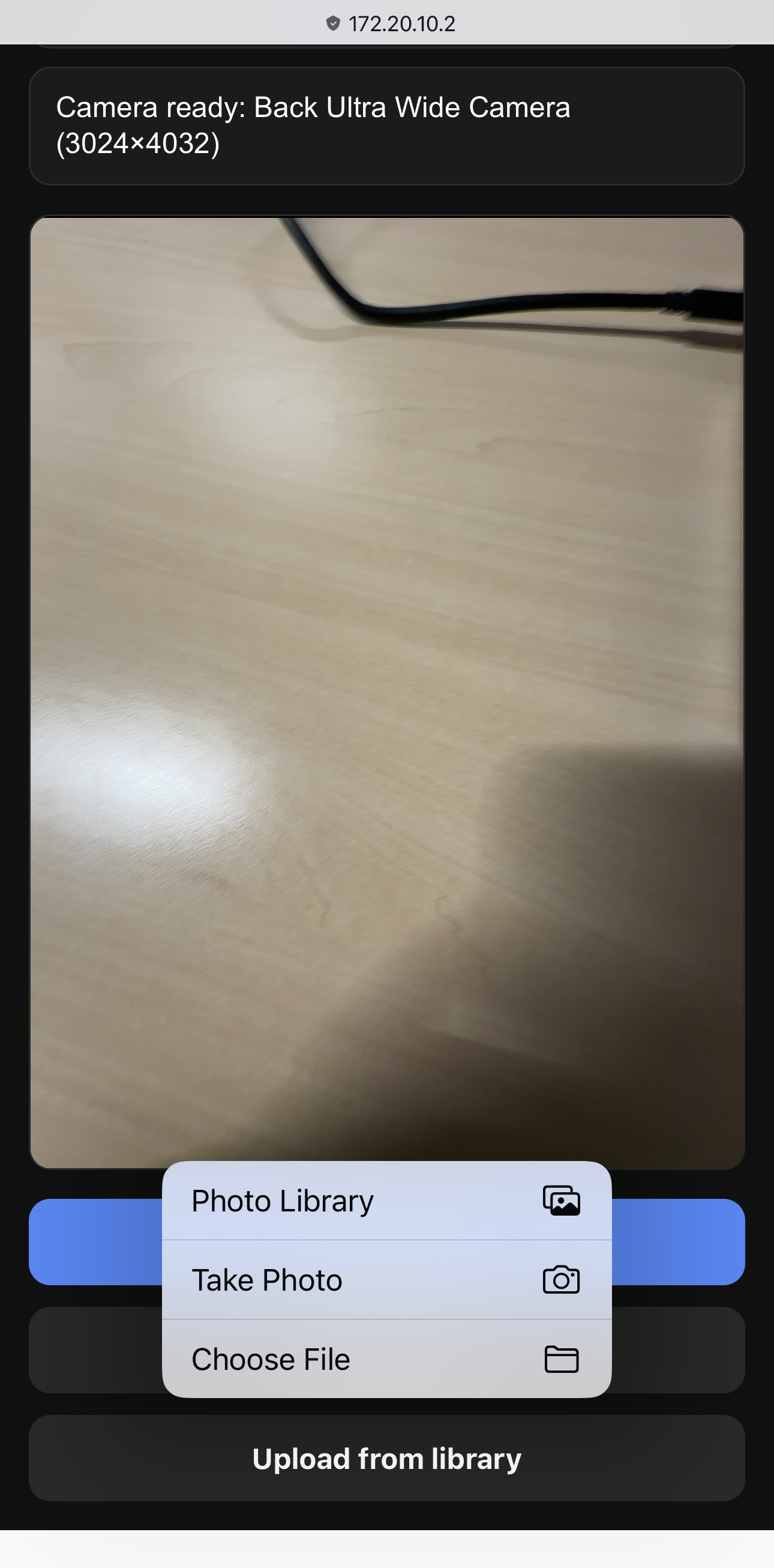
Figure 5. Phone view of the home page with file upload.
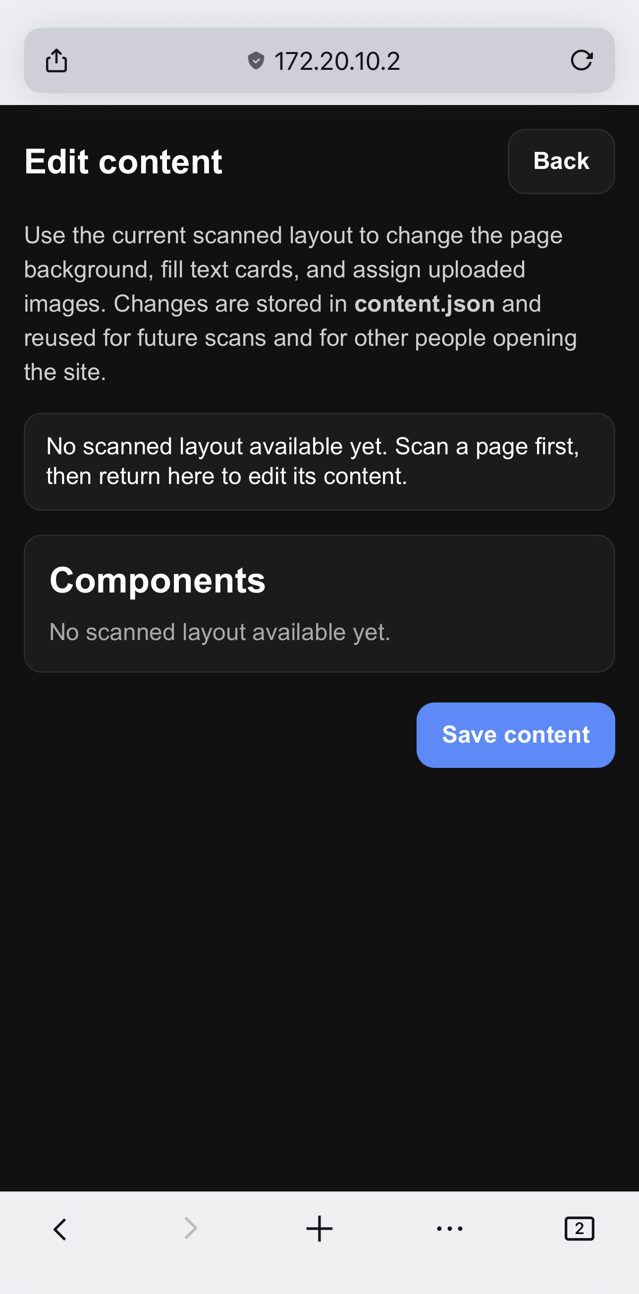
Figure 6. Phone view of the edit page (currenly no picture made).